Why planes fly in curves: the geometry of great-circle routes
By Jeff Beem
Updated
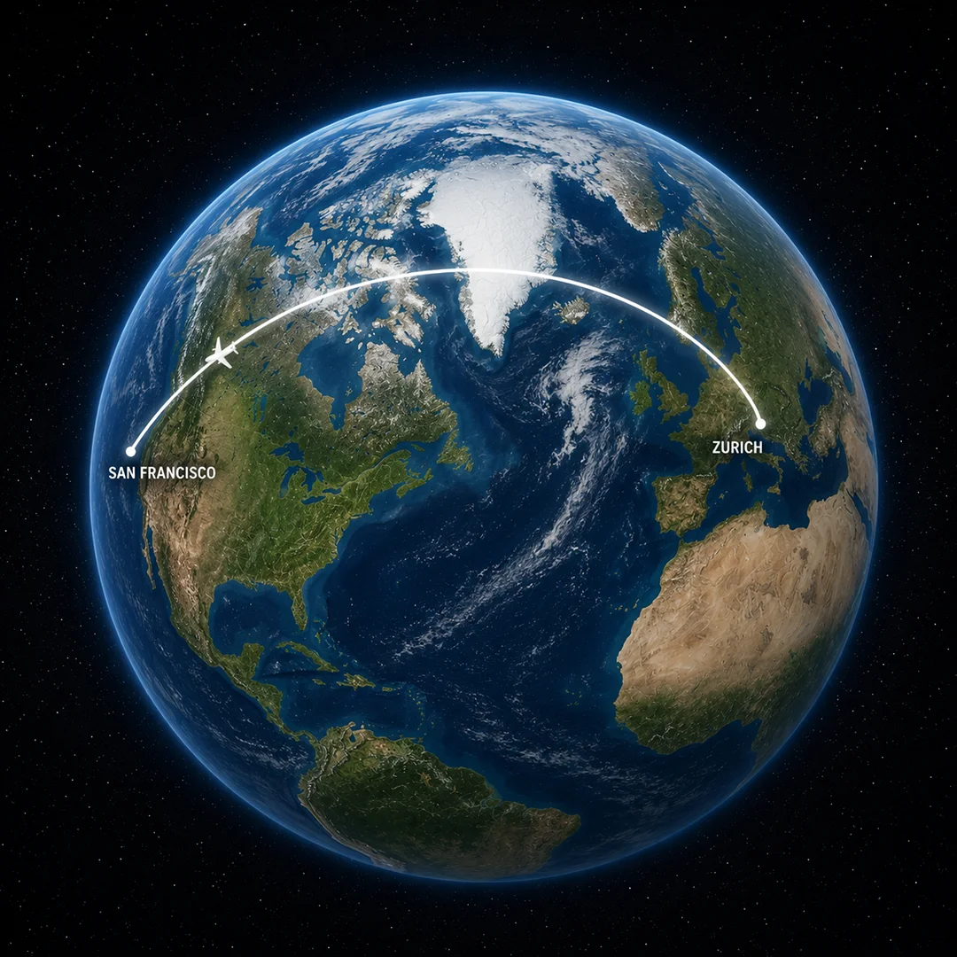
Somewhere over the North Atlantic, probably on a flight that has been serving warm nuts for thirty minutes and is about to stop, a person opens the seat-back flight tracker and notices something. The little airplane icon is not crossing the ocean in a straight horizontal line. It is arcing upward, curving noticeably toward Greenland, which seems wrong. Greenland is not between Zürich and San Francisco. Greenland is a large frozen island that nobody flies to on purpose.
The person in 14C shows this to the person in 14D. Neither of them knows why the plane is doing this. The person in 14D suggests the pilot might be avoiding weather. This is plausible and also completely incorrect.
The real answer is geometry. And once you see it, you cannot unsee it, and you will spend the rest of that flight feeling mildly smarter than everyone around you who is just watching movies.
The map has been lying to you since the third grade
Here is the problem. Every world map you have ever looked at on a wall, in a textbook, or on a classroom projector is almost certainly using the Mercator projection, or something like it. The Mercator projection takes a spherical planet and unrolls it onto a flat rectangle, which is useful for navigation but which distorts the shape and size of things the further you get from the equator. Greenland looks enormous on a Mercator map. By area it is in the same ballpark as Algeria (Algeria is slightly larger). Alaska looks gigantic next to the contiguous United States; its area is closer to Libya’s than the projection suggests. The whole top third of the map is stretched sideways in a way that makes the poles seem much further apart than they actually are.
More importantly for our purposes: on a Mercator projection, a rhumb line (constant compass bearing) is a straight line on the map. That is handy for navigation, but it is not the shortest surface distance between two arbitrary cities unless you happen to be following the equator or a meridian. Rhumb lines were useful for sailors in the 1500s because they could set a compass bearing and hold it without constantly recalculating. They are not the same thing as the fuel-minimizing paths modern long-haul aviation usually aims for when planners solve for track and winds.
The shortest path between two points on a sphere is something else entirely.
What a great circle is, and why it matters
Take a globe. Find New York and London. Now take a piece of string, hold one end on New York, stretch it taut across the surface of the globe to London, and pull it as tight as it will go. The path that string makes is a great circle route.
A great circle is any circle you can draw on a sphere whose center is also the center of the sphere. The equator is a great circle. Every line of longitude is a great circle (or half of one, technically). But most paths between two cities do not conveniently fall on the equator or along a meridian, so their great circle routes look curved when you project them back onto a flat map. That upward arc toward Greenland on the flight tracker is not a detour. On a spherical model it is the shortest surface path; flat maps (many trackers use a Mercator-style projection) stretch high latitudes, which can make that shortest path look like a bend even when it is not a detour in three dimensions.
This is the thing that breaks people’s intuitions: the sphere is the truth, and the flat map is the approximation. We are so accustomed to reading flat maps that we treat the distortion as normal and the spherical geometry as the aberration. It is the other way around. The flight path is the honest one. The map is the weird one.
The shortest path between any two points on a sphere always follows a great circle arc. This is a geometric fact that does not care about your intuitions or your Mercator upbringing. In the mathematics of curved surfaces, this kind of shortest path is called a geodesic. On a flat surface, a geodesic is a straight line. On a sphere, it is a great circle arc.
The formula hiding inside your GPS
Actually computing the great-circle distance between two points on Earth requires a bit more than string and a globe. You need the coordinates of both points (latitude and longitude), and you need a formula that turns those angles into a distance along a curved surface.
Consumer GPS gives you coordinates in a reference frame tied to an ellipsoid (today usually WGS84). For “how far apart are these two pins on a map,” many apps still use a spherical shortcut because it is fast and good enough for rough ranges; that shortcut is usually implemented with the Haversine formula. The underlying spherical trigonometry is old; Roger Sinnott’s 1984 Sky & Telescope piece, “Virtues of the Haversine,” helped popularize this form for small-angle work on computers. The name comes from the haversine function, half the versed sine of an angle: hav(x) = sin²(x/2). It looks obscure, but it stays stable for tiny angular separations in floating-point math better than naïve arcsine forms.
The formula looks like this:
a = sin²((lat2 - lat1) / 2) + cos(lat1) × cos(lat2) × sin²((lon2 - lon1) / 2)
d = 2R × atan2(√a, √(1 - a))
Where lat1, lat2, lon1, lon2 are the coordinates in radians (decimal degrees multiplied by π/180), R is the Earth’s mean radius (6,371 km), and d is the great-circle distance.
Breaking that down into plain language: the formula is computing how far apart two points are in terms of the angle they subtend at the center of the Earth, then converting that angle into a surface distance using the Earth’s radius. Writing the inverse trig as atan2(√a, √(1 − a)) is mostly about numerical stability (very small angular distances and floating-point behavior) compared with older asin forms that can lose precision.
You do not need to work through this by hand. The Distance Calculator uses a Geographic (lat/lon) mode that matches this article: decimal degrees in the inputs (with an optional degree-minute-second layout if you prefer), radians only inside the Haversine step, R = 6,371 km, then distance shown in kilometers and converted to statute miles, nautical miles, and other units. But knowing what is happening underneath is satisfying in the same way it is satisfying to understand how a car engine works even if you never intend to rebuild one yourself.
Zürich to San Francisco, actually calculated
Let us run the real example that started this whole conversation.
Zürich Airport (ZRH) sits at approximately 47.4647° N, 8.5492° E. San Francisco International Airport (SFO) is at approximately 37.6213° N, 122.3790° W.
Converting to radians (multiply degrees by π/180):
- lat1 = 47.4647 × (π/180) = 0.8285 radians
- lat2 = 37.6213 × (π/180) = 0.6567 radians
- lon1 = 8.5492 × (π/180) = 0.1492 radians
- lon2 = -122.3790 × (π/180) = -2.1364 radians
Plugging those into the Haversine formula (skipping the intermediate arithmetic in the interest of everyone’s patience):
a ≈ 0.45049 (your intermediate rounding may show 0.4505)
d = 2 × 6371 × atan2(√a, √(1 − a)) ≈ 9,376 km (full precision is about 9,375.7 km; printed results round)
That is roughly 5,826 statute miles, or about 5,062 nautical miles (using the 1.852 km international nautical mile).
Now here is the interesting part. On a Mercator map, a rhumb line (constant compass bearing) is a straight line on the page. That is not the shortest surface path between Zürich and San Francisco. Compared with the great-circle arc, that rhumb path is longer for this city pair, even though it looks like the “straight” airline across the map. The great-circle path pulls northward, closer to the pole, because that is where the sphere curves in a way that shortens the journey. Greenland is not a destination. It is a waypoint on the shortest possible path, and the airplane is simply following the geometry.
You can verify the numeric result in the Distance Calculator by choosing Geographic (lat/lon) and entering those coordinates: the readout should match this spherical Haversine distance (up to rounding). The embedded map places the two endpoints on a Web Mercator basemap (OpenStreetMap) and draws the great-circle arc between them (sampled on the same sphere model as the Haversine distance).
The Earth is not actually a perfect sphere
There is one honest caveat worth mentioning. The Haversine formula assumes a perfectly spherical Earth with a radius of 6,371 km. The Earth is not a perfect sphere. It is an oblate spheroid, meaning it is slightly squashed at the poles and slightly bulging at the equator. The equatorial radius is about 6,378 km and the polar radius is about 6,357 km, a difference of roughly 21 km.
For most everyday purposes (ballpark range between cities, classroom estimates), Haversine error versus a proper ellipsoidal distance is usually well under one percent, though it varies with latitude and direction. On a ~9,376 km hop, even a percent-scale mismatch is on the order of tens of kilometers, tiny next to how wide air corridors and routing constraints are. Flight computers and filing systems use richer models; Haversine is a spherical teaching tool and a common app shortcut, not the FAA’s entire pipeline.
For applications that require higher precision, like satellite positioning or geodetic surveying, there is a more complex approach (often Vincenty inverse/direct geodesics on an ellipsoid) tied to standards such as WGS84 (the usual frame for consumer GPS coordinates). Published implementations target very high precision for surveying work; global noise, antenna phase-center modeling, and numerical edge cases mean “sub-millimeter everywhere” is not how most apps behave in practice.
The Haversine formula is the right tool for almost everything people actually need. Ellipsoidal geodesics are the right tool when your tolerances are tight enough that Earth flattening matters more than convenience.
Where this math shows up in real life
Great-circle distance is not just an aviation curiosity. It turns up anywhere that software needs to compute the distance between two geographic coordinates.
Ride-hailing apps often use a quick spherical distance (Haversine or equivalent) as a first guess before road network routing costs kick in. Dating apps frequently show profile distance with the same spherical shortcut because it is cheap and monotone (closer on the map reads closer in the number). Ocean shipping and aviation planning layer weather, lanes, and regulation on top of baselines that may start from great-circle ideas. Weather radar “nearest site” lookups often use spherical distance as a cheap filter. Any “distance to pin” readout that is not explicitly following roads is usually some variant of this great-circle (surface arc) distance on a sphere.
The same spherical trig appears in astronomy when you want the angular separation between two directions on the sky: right ascension and declination play the roles of longitude and latitude on the celestial sphere. That sphere is only a modeling device, but the angle math is the same as on Earth’s latitude and longitude because both are problems on a unit sphere.
Why the pilot did not just go straight
Back on that flight. The person in 14C is still bothered. The plane is still arcing over the cold north. But now you know that the word “straight” is doing a lot of heavy lifting in that complaint. Straight on the map is not straight on the planet. Straight on the planet is what the plane is doing.
The great-circle route between Zürich and San Francisco is not the one that looks horizontal on a Mercator projection. On a perfect sphere, the shortest surface path is that polar arc. The real Earth is closer to an oblate spheroid, so true geodesics differ slightly from pure great-circle geometry; flight planners and survey-grade tools account for that when it matters. The Distance Calculator intentionally sticks to the spherical Haversine model (same story as this article’s worked example), not an ellipsoidal geodesic solver.
That path arcs northward because, on the sphere model, that is where the geometry shortens the surface track versus a lower-latitude rhumb; airlines also avoid unnecessary miles when traffic and weather allow, which usually tracks those ideas in broad strokes.
What looks like a detour is the whole point. The map is an approximation. The geometry is the reality. And somewhere over Greenland, if you look out the window at exactly the right moment, you will see nothing but ice and the faint suggestion of a coastline, which is also correct. That is where the math said to go.
The Distance Calculator lets you enter any two coordinates (for example Tokyo and Chicago, or Sydney and Johannesburg) and read off the same spherical great-circle distance. On a wall Mercator map the shortest path still arcs over high latitudes; the tool’s map draws that arc on the basemap so the curve you see matches the Haversine geometry.
Sources
- Sinnott, R.W. (1984). “Virtues of the Haversine.” Sky & Telescope, 68(2), p. 159. Widely cited note on using the haversine form for stable small-angle calculations (spherical navigation math predates this article).
- National Geodetic Survey: Geodesy for the Layman (NOAA-hosted edition of DMA TR 80-003; table of contents and chapter links; ellipsoid and WGS material in later chapters).
- Vincenty, T. (1975). “Direct and Inverse Solutions of Geodesics on the Ellipsoid.” Survey Review, 23(176), pp. 88-93. Classic reference for ellipsoidal geodesics (WGS84-era tooling often builds on this family of algorithms).